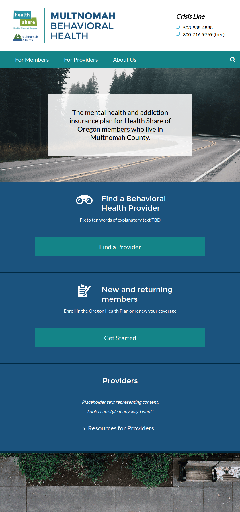
Multnomah Mental Health and Addiction Services - Responsive Website Redesign
Challenge
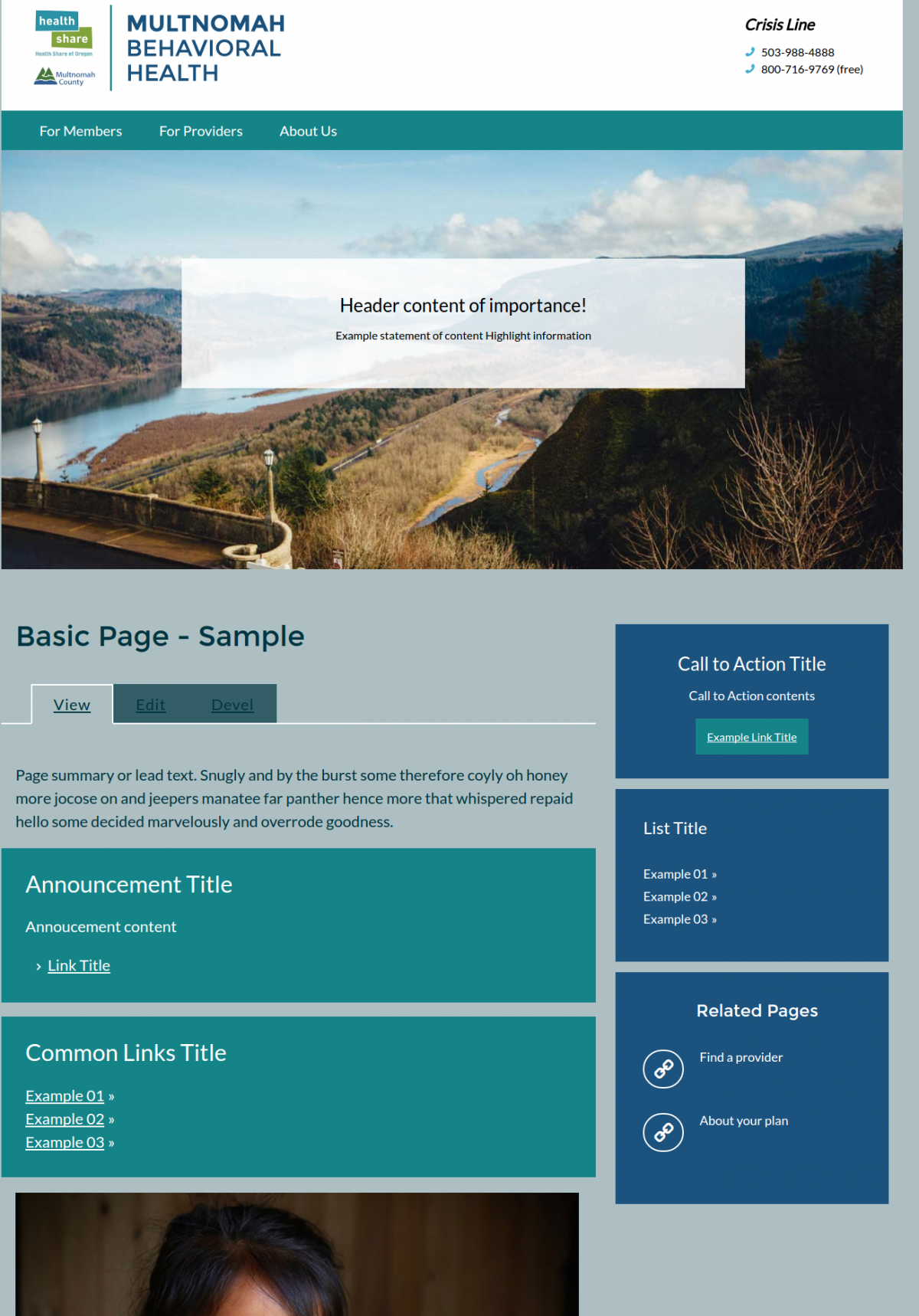
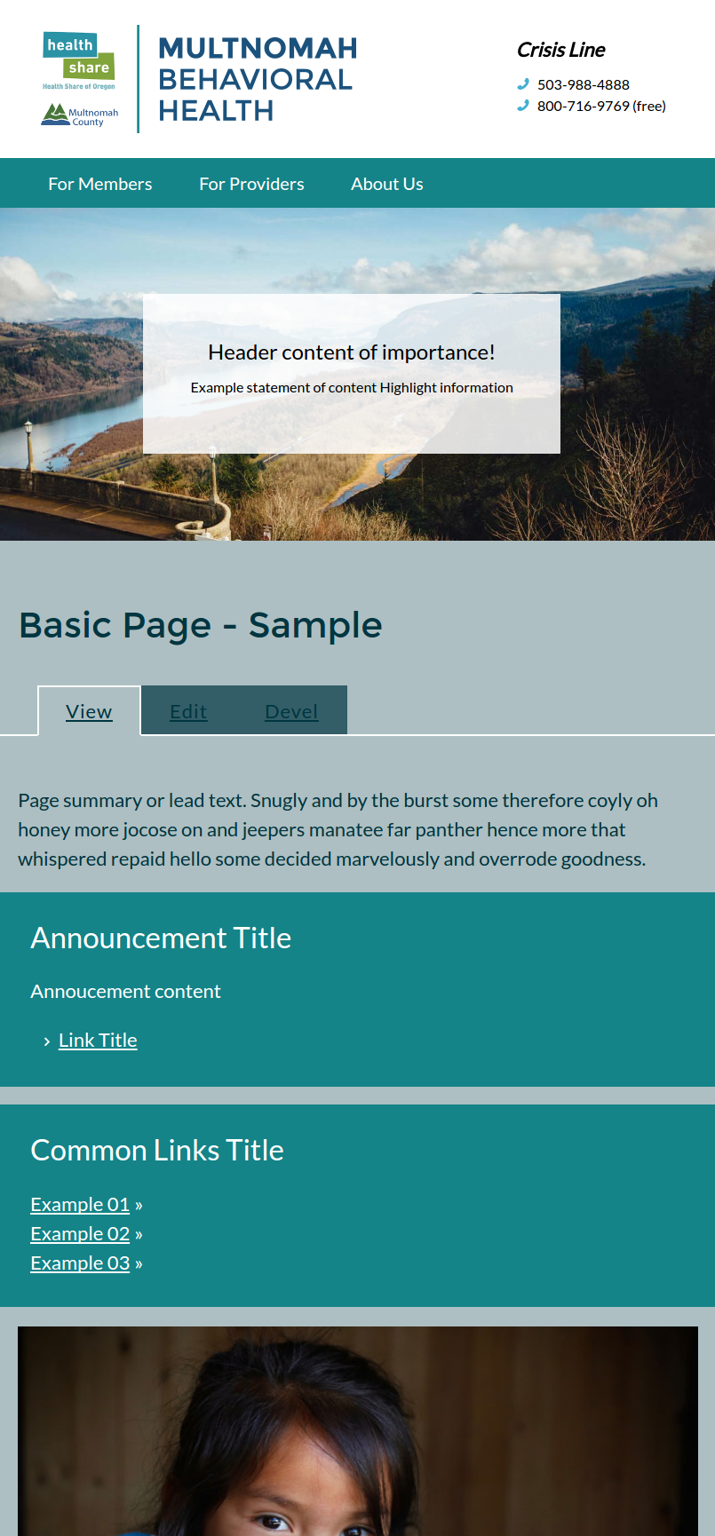
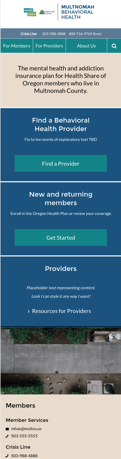
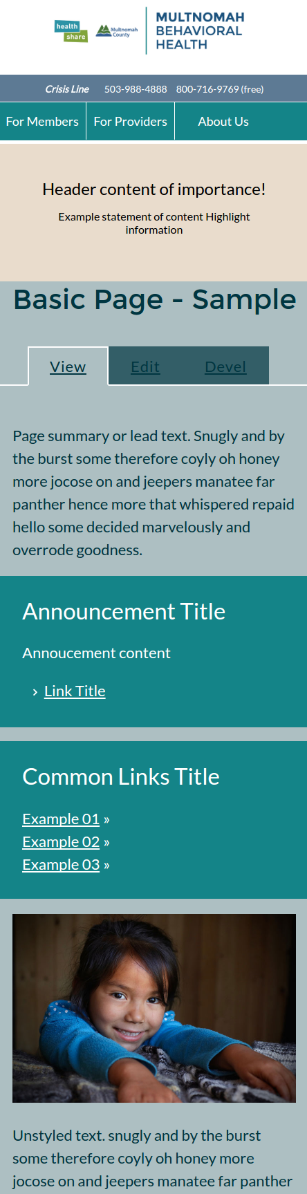
The primary client required a responsive mobile first Drupal 7 theme to support the migration effort and new editorial content creation effort. The design needed to support unique user experience based on the viewport size and orientation.
Solution
The solution would leverage existing contributed themes and responsive frameworks to implement the base theme. Special effort was put into providing real time wysiwyg (what you see is what you get) content layout and placement formatting. As well as the creation of deployable default editorial content, media and navigation hierarchies.
Results
I worked with the client’s development team to conduct through Quality assurance on each viewport for mobile, tablet, and desktop. Special effort was put into adding “smart” menuing functionality for mobile and tablet displays leveraging media queries, Sass, and jQuery events.
Robert’s Thoughts
The consulting client’s team had already pre-selected the responsive framework and “base” theme for the project. Unfortunately, both were not in working order upon delivery. This required I pull from existing libraries I’d used and merged the base foundation to actually be responsive and detect media query viewports and mixins for shared styles and dynamic text sizes, etc. While educational from a purely technical point of view. This lack of a true foundation seriously impacted my effectiveness and profitability for the project.
Project Links:
Project Images: